Basket Summary
There are no more items in your basket
By Type
Guides · Interiors
A room-by-room guide to choosing wall colours with real confidence.
Colour never works alone. Light, flooring, furniture, and the rooms next door all influence how a paint colour actually reads on your walls. Get the combination right and the room feels warm, considered, and inviting. Get it wrong and even the loveliest sofa can look a little lost. This guide walks you through how to choose wall colours with real confidence, room by room, orientation by orientation, so the result looks — and feels — exactly like the calm, considered space you're picturing.
In this article
I. How to choose the right wall colour
II. Wall colour ideas for every room
III. What colour should I paint my living room?
IV. What colour should I paint my bedroom?
VI. How room orientation affects paint colours
VII. The best wall paint colours that never go out of style
VIII. Common mistakes to avoid when choosing wall colours
Before you fall for a colour on Pinterest, take a proper, honest look at the room you are painting. A shade that sings in a bright, open-plan kitchen can turn muddy and flat in a small hallway with one window. The tips below will help you make a choice you will still love a year from now.
Consider the natural light. Walk into the room at different times of day and notice how the light shifts. A bright, south-facing room can carry cooler, more dramatic colours beautifully. A darker room with limited daylight usually wants a warmer, lighter shade to bounce what little light there is around the walls and lift the whole space.
Think about room size. Lighter colours reflect light and make a small room feel more open. Deeper colours draw the walls in and create a sense of intimacy, which can be wonderful in a snug or bedroom, but tricky in a compact bathroom. Neither is right or wrong. It is entirely about the feeling you want the room to have.
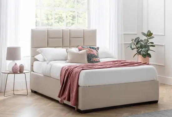
Work around existing furniture. Your sofa, bed, or dining table is almost certainly staying put. Pull your colour palette from those pieces first. If you are choosing a shade to complement one of our storage sofas or storage beds, start with the fabric colour and build the wall colour around it, not the other way round. Your furniture will thank you for it.
Look down at the flooring. Oak floors bring warmth and pair beautifully with soft whites, greiges, and earthy greens. Grey floors sit more comfortably with cool neutrals and deeper blues. Dark wood can carry richer, more dramatic shades. The floor is a huge colour surface in any room, so it deserves a proper say in the decision.
Understand warm versus cool. Every paint colour has an undertone. Warm undertones (yellow, red, brown) feel cosy and welcoming. Cool undertones (blue, green, grey) feel calm and fresh. A room usually wants to lean one way or the other, not both at once. Getting this right is what separates a room that feels cohesive from one that feels slightly off.
Test paint samples before you commit. Paint two or three proper A4-sized patches on different walls in the room. Live with them for a few days. Look at them in morning light, afternoon light, and under your evening lamps. If you are also choosing furniture at the same time, order some free fabric samples from Furl and hold them against the paint patches so you can see exactly how the two work together. It makes all the difference.
Every room in your home has its own job to do, and the wall colour should support that job. A bedroom needs to feel restful. A kitchen needs to feel bright and energising. A hallway needs to welcome you home the moment you walk through the door. Below are colour ideas for the rooms that tend to cause the most head-scratching.
Kitchens should feel clean, energetic, and welcoming. This is the room where mornings start and dinner parties happen, so the walls need to work hard across both. Soft whites with a warm undertone, think off-whites with a hint of cream, keep the space feeling fresh without going clinical. Sage green has become a modern classic in kitchens and works beautifully with wooden worktops and brass fixtures. For something bolder, a deep navy on a single wall pairs stunningly with white cabinetry and marble surfaces.
Hallways set the tone for the whole home. They are often narrow and short on natural light, so warm, welcoming shades tend to work best. Warm off-whites, soft greiges, and pale earthy pinks reflect what little light there is and create a genuine sense of arrival. If you have a wider hallway with good light, a richer shade like muted terracotta or deep olive can turn a purely functional space into a real feature.
Dining rooms are made for lingering. Deeper, more enveloping colours work brilliantly here because you tend to use the room in the evening under warm, flattering lighting. Rich burgundy, forest green, and dark teal all create the kind of intimate atmosphere that makes a Sunday lunch feel like a proper occasion. If you prefer something lighter, a warm taupe or soft mustard flatters everyone sitting at the table.
Bathrooms benefit from colours that feel fresh and calm. Soft blues, sage greens, and warm whites are perennial favourites because they read as clean without ever feeling cold. For a more spa-like feel, muted earthy tones like clay pink or pale terracotta pair beautifully with natural stone and brass. Avoid anything too grey in a bathroom without natural light. It can pull the room in a chilly, unwelcoming direction very quickly.
The living room is the heart of the home. It is where you unwind at the end of a long day, host the people you love, and spend more waking hours than almost anywhere else in the house. That makes the wall colour a decision worth slowing down on. A well-chosen shade will flatter your furniture, work beautifully with the light, and make the room feel like somewhere you genuinely want to be.
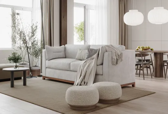
Neutrals are the workhorses of the living room. They give you flexibility, they age brilliantly, and they let your furniture do the talking. Warm whites with a hint of cream, soft greiges, and gentle taupes are all sophisticated, enduring choices. The trick is picking a neutral with the right undertone for your light. Cool neutrals in a north-facing room can feel a little flat, while warm neutrals in a very sunny room can tip towards yellow. It is worth taking the time to get it right.
Warm colours (muted terracottas, soft ochres, dusky pinks, and gentle warm browns) instantly make a living room feel more inviting and alive. They also flatter skin tones, which is worth knowing if you like to entertain. A warm, earthy shade across all four walls creates a genuinely cosy space, especially when paired with soft textures and one of our storage sofas in a complementary fabric.
A single dark wall can completely transform a living room. Deep navy, charcoal, forest green, and inky plum all work beautifully as feature walls, particularly behind a sofa or a fireplace. Furl Blue itself — the muted, slate-toned navy at the heart of our own palette — is a lovely example of this kind of calming depth, working just as well on a single wall as it does across fabric and furniture. Pair a dark feature wall with lighter surrounding walls, plenty of soft lighting, and warm timber tones to keep the room feeling balanced and welcoming rather than heavy. It is a modern classic for very good reason.
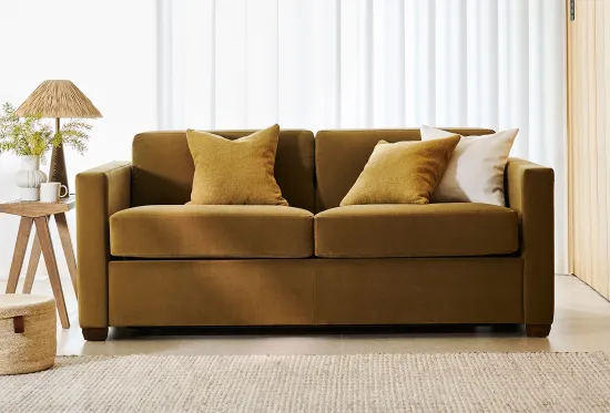
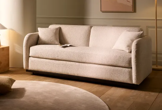
Some pairings simply work, and work brilliantly. Warm white walls with a natural linen sofa and oak flooring. Sage green walls with a mustard velvet sofa and brass accents. Deep navy walls with a cream boucle sofa and black metalwork. Greige walls with a dark grey storage sofa and warm wood tones. The best schemes lean consistently into either warm or cool territory, rather than trying to mix the two.
Your sofa is usually the biggest colour statement in the living room, so the wall should complement it rather than compete with it. If you are working around an existing piece, or planning a new sofa purchase, our guide on choosing your living room colour scheme walks you through the pairings that consistently look brilliant together, and the ones that are best avoided.
The bedroom has one job above all others: help you rest properly. That means the wall colour needs to feel calm, soft, and genuinely easy on the eye at the end of a long day. Bright, punchy colours belong elsewhere. Bedrooms want colours that lower the temperature of the room the moment you walk in.
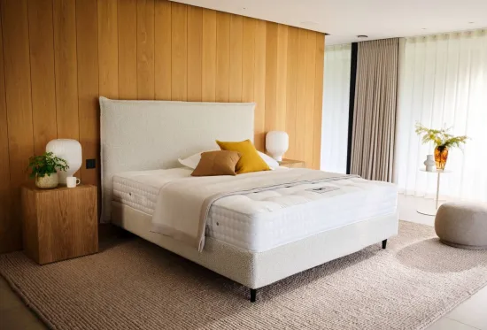
Colour psychology consistently points to soft blues, muted greens, and warm neutrals as the most restful choices. Pale blue walls have a measurable calming effect and pair beautifully with white bedding and warm timber. Sage green feels restorative and works especially well in bedrooms with plenty of natural light and plants. Warm off-whites and soft greiges give you a peaceful, hotel-like feel that never dates. All three work perfectly alongside one of our storage beds, which quietly take care of the clutter that would otherwise disturb the calm you have worked so hard to create.
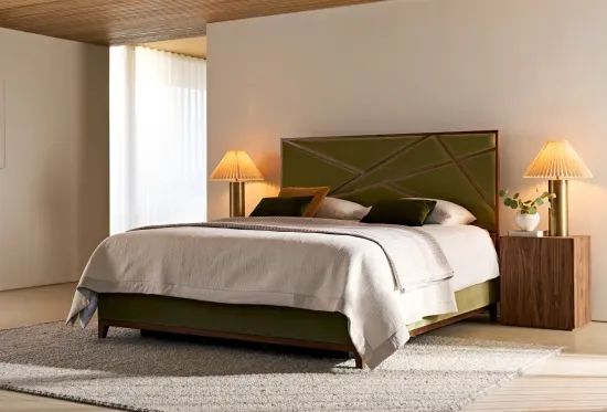
Current bedroom trends lean beautifully into softness. Dusky pinks, muted terracotta, and warm clay tones create a gentle, welcoming feel without ever tipping into saccharine. Deep, muted greens (think olive and eucalyptus) have become a firm modern favourite for a more grown-up, considered bedroom. On the moodier end, deep navy and charcoal are having a real moment as full-room bedroom colours, especially when paired with warm brass lighting and layered bedding for that truly luxurious feel.
For a bedroom that feels genuinely luxurious, work with a tonal palette rather than a contrasting one. Layer three or four shades from the same colour family, warm whites, soft taupes, deeper stones, and warm browns for a serene neutral scheme, for example, and let texture do the heavy lifting. Velvet cushions, linen bedding, wool throws, and a beautifully upholstered storage bed in a plush fabric will turn even a modestly sized room into something that feels like a boutique hotel. You will be amazed at the difference.
Want to see this kind of thinking play out in a real home? In this video, we walk through a small bedroom with no built-in wardrobe at all — a storage bed does that job instead, keeping the room calm, clutter-free, and easy to sleep in. The walls are painted in Farrow & Ball's Inchyra Blue, a deep, warm blue-green that pairs beautifully with a storage bed doing double duty as a wardrobe.
The light switches you can see throughout are by Buster + Punch — a lovely finishing touch alongside the Inchyra Blue walls and the storage bed.
Which way your windows face changes everything. The same paint colour can look warm and glowing in a south-facing room and cold and flat in a north-facing one. Sunlight also shifts throughout the day, so a colour that looks lovely at 9am might feel completely different by 6pm. Understanding your room's orientation is one of the most practical things you can do before picking up a paint chart.
North-facing rooms receive the coolest, most consistent light throughout the day. This can make cool colours (crisp whites, pale greys, cool blues) feel chilly or slightly grey rather than fresh. To counteract that, choose warm-toned colours. Warm whites with a creamy or yellow undertone, soft greiges with a hint of pink, earthy neutrals, and muted soft greens all bring real warmth to a north-facing space. Avoid anything with a strong blue or grey undertone unless you actively want a cool, minimalist feel.
South-facing rooms are blessed with warm, generous natural light for most of the day, and that gives you so much more to play with. Cool neutrals look crisp rather than cold. Rich, saturated colours (deep greens, navy blues, warm terracottas) glow beautifully in south-facing light. Pure whites read as clean and elegant rather than clinical. If you have a south-facing room, this is the space where you can really experiment and have some fun.
West-facing rooms have a distinctive rhythm. Mornings are cooler and softer. Evenings are golden and warm. That shifting light can make yellow-based colours look beautiful at sunset but a little muddy come morning. The most reliable approach is to choose colours that hold their own across both moods. Soft greiges, muted greens, and warm-but-not-yellow whites all do this brilliantly. Steer clear of pale yellows and warm creams, which can tip into orange as the sun sets.
East-facing rooms enjoy bright, cheerful morning light and gentler, cooler afternoons. You want colours that feel fresh at 8am without turning flat and dull by 4pm. Versatile, mid-tone neutrals work brilliantly here. Warm whites, soft greiges, gentle sages, and pale blues all read beautifully across the full day. Because the light changes so much in these rooms, testing samples in both morning and afternoon light really does matter before you commit.
Trends come and go, but a handful of colours have been quietly making rooms look wonderful for decades. These are the shades that flatter almost any style of furniture, from a linen storage sofa to a velvet storage bed, and will still look considered and beautiful ten years from now.
Warm white. The single most versatile colour in the paint world. A warm white brightens a room without ever feeling clinical, works with every timber tone, and lets your furniture take centre stage where it belongs. Perfect for living rooms, bedrooms, and hallways.
Greige. The clever child of grey and beige. Greige gives you the softness of a warm neutral with just enough modern edge from the grey. It pairs beautifully with both cool and warm accents, making it a brilliant choice if you love to refresh your soft furnishings from time to time.
Taupe. A gentle, sophisticated brown-grey that feels grown-up without ever feeling stuffy. Taupe walls flatter velvet furniture, warm timber, and brass detailing especially well. A quiet showstopper that earns its place in any room.
Stone. A soft, chalky neutral with subtle warmth beneath the surface. Stone reads as calm and considered, and works beautifully in bedrooms, snugs, and dining rooms where you want the walls to feel restful rather than loud.
Charcoal. For those brave enough to go for it, charcoal is a true modern classic. It creates instant drama, flatters warm lighting, and makes soft-coloured furniture absolutely pop. Best used in rooms with decent natural light, or on a single striking feature wall.
Even beautiful colours can go wrong in the wrong context. These are the pitfalls we see most often, and how to sidestep them before you pick up a brush.
Ignoring natural light. A colour that looks stunning in the shop, on a screen, or in someone else's south-facing kitchen can look completely different in your north-facing lounge. Always test samples in your own space, at multiple times of day. It is the single most important thing you can do.
Choosing from tiny paint chips. Those postage-stamp squares in the shop are almost impossible to judge properly. A colour always reads darker and more saturated on a full wall than it does on a tiny chip. Buy sample pots and paint proper A4-sized patches before you commit to anything.
Forgetting undertones. Every colour has an undertone hiding underneath. A "grey" can lean blue, green, or purple. A "white" can lean yellow, pink, or blue. When undertones clash with your flooring or furniture, the whole room feels slightly off in a way that is hard to put your finger on. Hold a plain sheet of white paper next to your paint sample to reveal the undertone honestly.
Following trends only. Trend colours are wonderful for cushions, throws, and easily-swapped accessories. For a whole room, choose colours you genuinely love and that flatter your furniture properly. Repainting is a big job. Timeless, considered choices reward you for years.
Not considering adjoining rooms. Colours never live in isolation. Walk from one room into another and notice how the shades sit together. Two individually lovely colours can clash horribly when placed side by side without a considered transition. Aim for palettes that flow gently from room to room, especially in open-plan spaces.
These are the questions our team gets asked most often when customers are choosing wall colours to work with their new sofa or storage bed. Honest, straightforward answers below.
Light, soft colours reflect more natural light and make walls feel further away, which visually opens up a room. Warm off-whites, soft greiges, and pale blues are all excellent choices for making a small space feel far more generous than it is. Painting the ceiling the same light shade as the walls also removes visual boundaries and makes the room feel taller. It is one of those tricks that genuinely works.
Not necessarily. A consistent palette across your home creates a lovely sense of flow, but each room can absolutely have its own character within that palette. Aim for colours that share an undertone (all warm, or all cool) so the transitions feel natural rather than jarring. Repeating one or two colours throughout the house is a lovely way to tie everything together.
Three to five is the sweet spot. Any fewer and you risk missing a better option. Any more and you can talk yourself in circles. Narrow your shortlist down using paint chips first, then paint proper A4 patches of your top three to five choices on different walls in the room. Live with them for a few days before deciding.
Warm off-white. It works in almost any room, with almost any furniture, in almost any light. It flatters warm and cool accents equally, brightens darker rooms without feeling stark, and never dates. If you are ever in doubt, warm off-white is the answer.
Both approaches work beautifully depending on the effect you are after. A white or paler ceiling makes the room feel taller and lighter, which suits smaller rooms especially well. Painting the ceiling the same colour as the walls (or very slightly lighter) creates a wonderfully cocooning, enveloping feel that suits bedrooms, snugs, and dining rooms perfectly.
Open-plan spaces work best with a tonal palette rather than dramatically different colours in each zone. Choose one main wall colour and use deeper or lighter variations from the same family to define specific areas (a slightly deeper shade behind the dining table works beautifully, for example). Consistent flooring and coordinated furniture help tie all the zones together visually.
Ready to see it come together?
Clear your space, free your mind — and let your walls do some of the work. Want to see how one of our sofas or storage beds would look alongside your chosen colour scheme? Order some free fabric samples or visit one of our London showrooms to see our products in real life. Our friendly team will be delighted to help you find the perfect pairing.