Walk into a bedroom and notice how quickly you form an impression of its size. Sometimes a small room feels expansive, while a larger one can feel oddly compressed. More often than not, colour is the culprit. The shades we choose for walls, furniture, and textiles quietly dictate how big - or how cramped - a space appears.

Understanding this isn’t about chasing trends or following arbitrary rules. It’s about learning how colour interacts with light and proportion, and then using that knowledge to create the bedroom you want, whether that’s cosy or spacious.

The Expansive Power of Light Shades

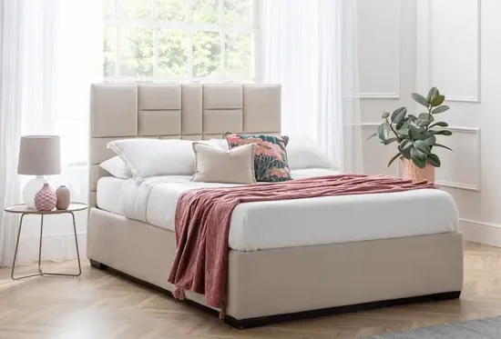
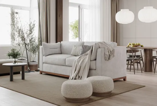
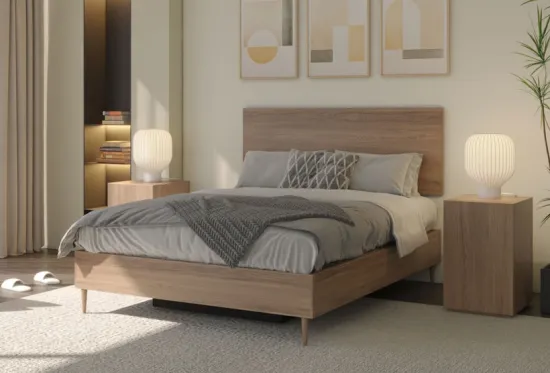
Pale tones are well known for making rooms feel larger, and for good reason. Lighter surfaces reflect more light, creating the illusion of openness. Whites, creams, and pale greys act like amplifiers, bouncing natural daylight across the space.

But the effect isn’t purely visual. A pale palette also affects mood. When you enter a white or soft neutral room, your eye rests less on boundaries - walls, corners, edges - and more on the flow of the space. Boundaries recede. Rooms breathe.

That said, not all “light” shades behave the same. Warm off-whites and soft taupes will make a bedroom feel welcoming, whereas cool blue-greys can sometimes feel stark, particularly in north-facing rooms with limited sunlight. Choosing the right undertone is as important as choosing the shade itself.

Air Storage Bed

Dark Colours: Cosy, Not Cramped

Dark walls have a reputation for shrinking spaces, but this isn’t the whole story. Used deliberately, deep hues create intimacy rather than claustrophobia. Navy, charcoal, or even forest green can blur the edges of a small bedroom, making walls feel like a cocoon.

The trick is balance. Dark walls need lighter contrasts elsewhere - crisp white bedding, pale flooring, reflective accents like mirrors or metallic lighting - to keep the room from feeling heavy. Rather than emphasising the size of the space, the dark colour reframes it: the room feels intentional, atmospheric, enveloping.

Colour and Ceiling Height

It isn’t just walls that matter. Ceilings, often overlooked, have a profound effect on perceived size. A white ceiling almost always makes a room feel taller by drawing the eye upwards. Painting it the same colour as the walls, however, can soften boundaries, making the room feel more unified and therefore larger in a different way.

For particularly low ceilings, vertical stripes or tonal variations that move from darker skirting to lighter walls also elongate the perception of height.

Furniture and Fabrics in the Mix

Wall colour sets the tone, but furniture and fabrics decide whether the illusion holds. A pale wall loses its spacious quality if every wardrobe and chest of drawers is bulky and dark. This is where integrated storage makes a difference. Instead of crowding a room with mismatched pieces, choose furniture that recedes visually - wardrobes in similar shades to the wall, upholstered storage beds in calm neutrals. These are not just beds, but bedroom solutions for decluttering, keeping floors clear so the colour scheme can do its work.

Soft furnishings also play their part. Sheer curtains filter daylight while adding height; tonal bedding layered in similar shades extends the sense of openness. Conversely, too much pattern can break up the flow, interrupting the eye and diminishing the illusion of size.

Playing with Contrast

High contrast - say, dark furniture against light walls - creates drama but can also accentuate the edges of the room. In small bedrooms this sometimes works against you, highlighting boundaries instead of softening them. Low-contrast schemes, where furniture, walls, and textiles sit within a similar tonal range, tend to feel calmer and more expansive.

That doesn’t mean avoiding colour altogether. A muted accent - a clay-coloured headboard against warm white walls, or a soft sage throw across pale bedding - introduces personality without fracturing the palette.

mirage storage bed in aplaka indigo colour

Natural Light and Orientation

The impact of colour depends heavily on the light entering the room. South-facing bedrooms bask in golden light, which warms cooler tones like grey or blue. North-facing rooms are cooler, making warm neutrals or earthy tones better suited. East-facing rooms benefit from soft morning sun, while west-facing rooms glow in the evening.

Considering orientation alongside colour choice is essential. The same paint swatch can feel airy in one room and oppressive in another, purely based on the quality of natural light.

The Psychology of Colour

Perception of size isn’t just optical - it’s emotional too. Colours carry psychological associations. Blue is calming and can make a room feel open, but too much may feel cold. Green connects to nature, offering freshness and balance. Warm neutrals feel secure and soft, while bright whites can veer towards clinical if not grounded with texture.

A bedroom should support rest. That doesn’t always mean the lightest shade. For some, a deep, moody colour creates a sense of calm that no amount of pale paint can achieve. The key is aligning colour with how you want to feel in the space.

Furl’s Perspective

At Furl, we see colour as only one piece of the puzzle. The way a room feels is as much about layout and function as it is about tone. Furniture that adapts - whether storage beds, extendable tables, or sofa beds - creates space both physically and emotionally. Colour then enhances it, giving the illusion of more room or more intimacy, depending on your choice.

Our experience suggests the most successful bedrooms combine both principles: clever design to keep clutter hidden, and a thoughtful palette to guide how the space is perceived. Together, they create rooms that feel larger, calmer, and more inviting, even when square footage is limited.

Bringing It Together

Colour can’t add actual square metres, but it can profoundly change how a bedroom feels. Lighter shades reflect light, creating openness; darker hues add intimacy and depth; tonal consistency and considered contrasts refine the effect further. Combined with practical storage, these strategies make even the smallest rooms feel expansive and intentional.

Ultimately, choosing the right colour isn’t about following hard rules but about curating how you want the room to feel. Spacious or cocooning, airy or grounded - colour is the quiet architect of perception.

mirage storage bed in aplaka indigo colour

Related Products

David Norman

David Norman is the founder of Furl, a UK-based furniture brand known for redefining how people live with space-saving, design-led storage beds and sofa beds.

With almost two decades of hands-on experience in product design, manufacturing, and brand strategy, David has built Furl into a trusted name among urban professionals seeking calm, clutter-free homes. His work has been recognised for its innovation and craftsmanship, with features in publications such as Yahoo Finance and The Telegraph.

David continues to lead Furl’s creative direction, developing furniture that solves real-world problems without compromise.